
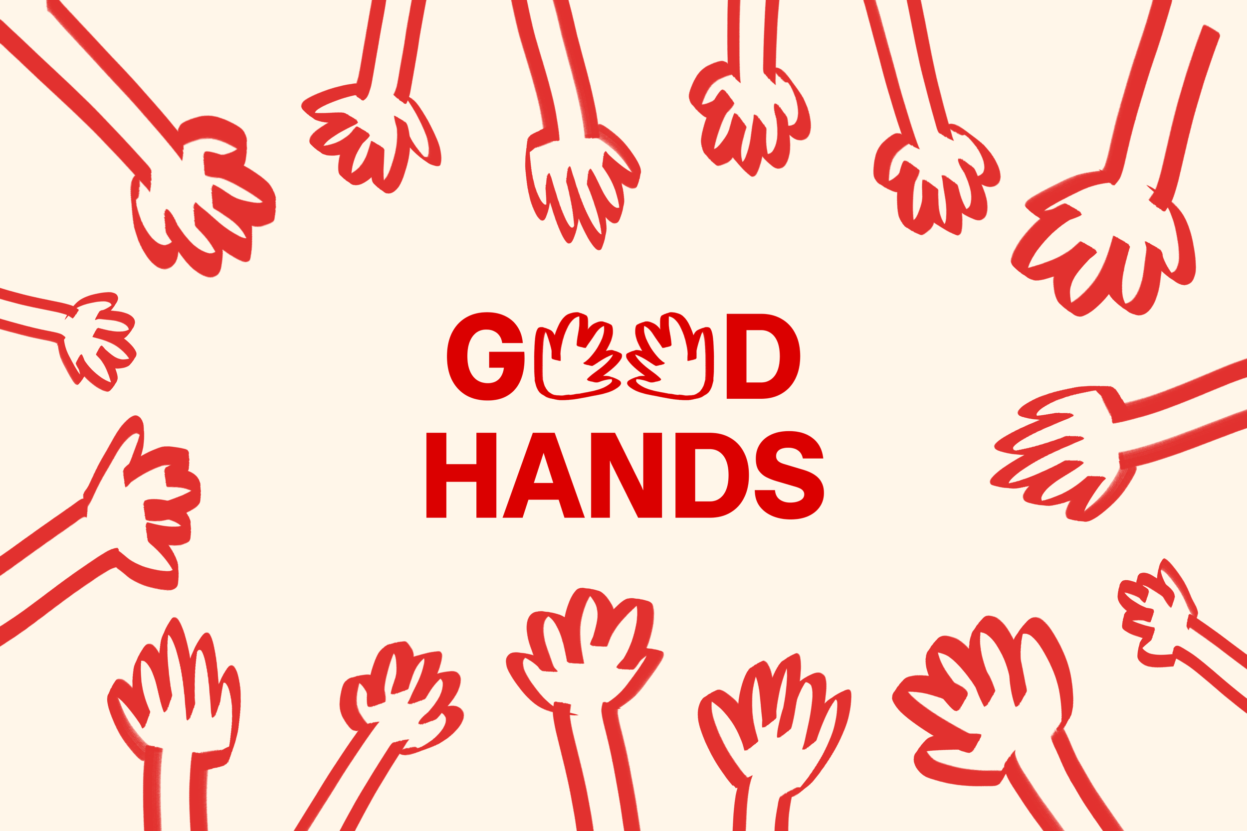

Good Hands is an eczema skincare brand concept designed to transform eczema products from cold and serious to fun and approachable.
Growing up with eczema, I used only pharmacy-brand products with the typical pharmacy look and feel. In recent years, I’ve noticed skincare brands introducing products marketed as suitable for eczema-prone skin. I appreciate that they don’t have conventional medicinal packaging, but these products aren’t made to target eczema. While the pharmacy-style packaging has a cold, intimidating look, their products are effective. Whereas ordinary skincare brands have fun, creative designs, they do not formulate products specifically for eczema-prone skin.
In my ideal world, the product’s effectiveness plus fun packaging would be the perfect combo for daily use and enjoyment. Like many others, these skincare products are an essential part of my everyday life. I’d love to see refreshing designs that don’t make me feel like I just took prescribed medicine. So, I designed one.
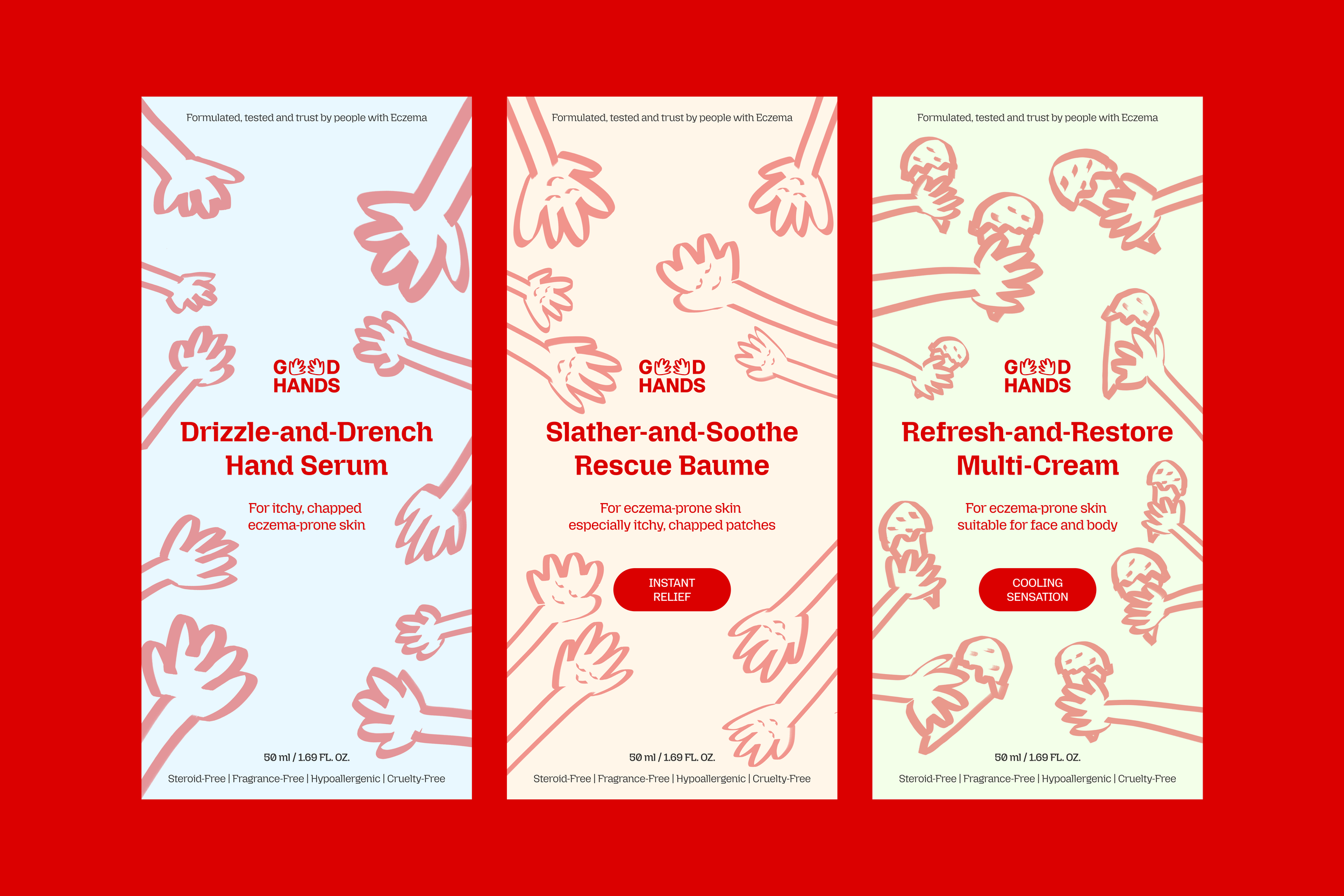
I wanted to keep the illustrations pretty simple and inspired by each product’s benefits. I also played around with the angles and placement to convey the feeling of using them. E.g. the arms are mostly parallel for the rescue baume to give a soothing, harmonious vibe.
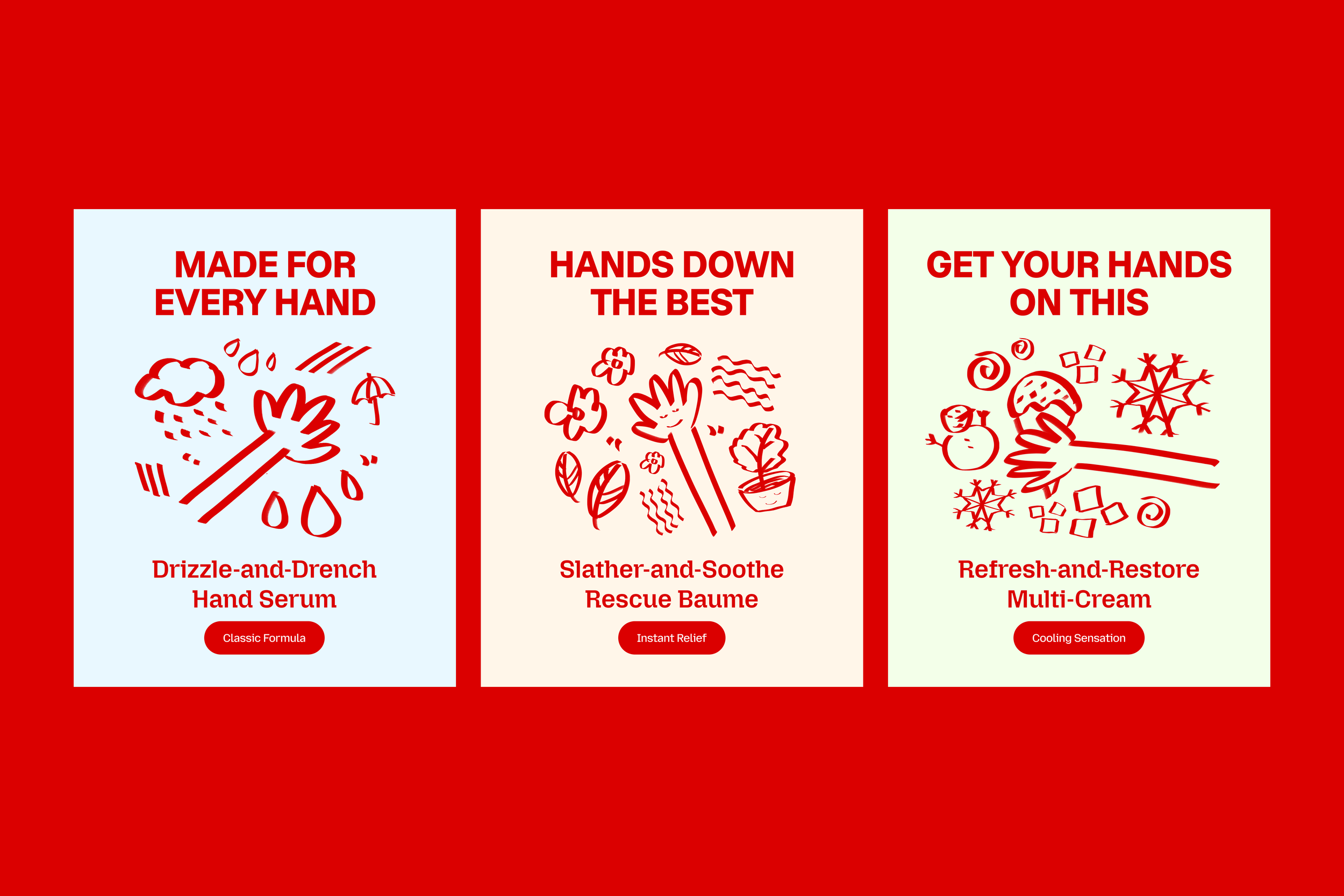
I imagined marketing materials for product launches that didn’t show the product itself. Instead, I communicated the feeling and sensation the formula gives you with illustrations and simple lines and shapes.
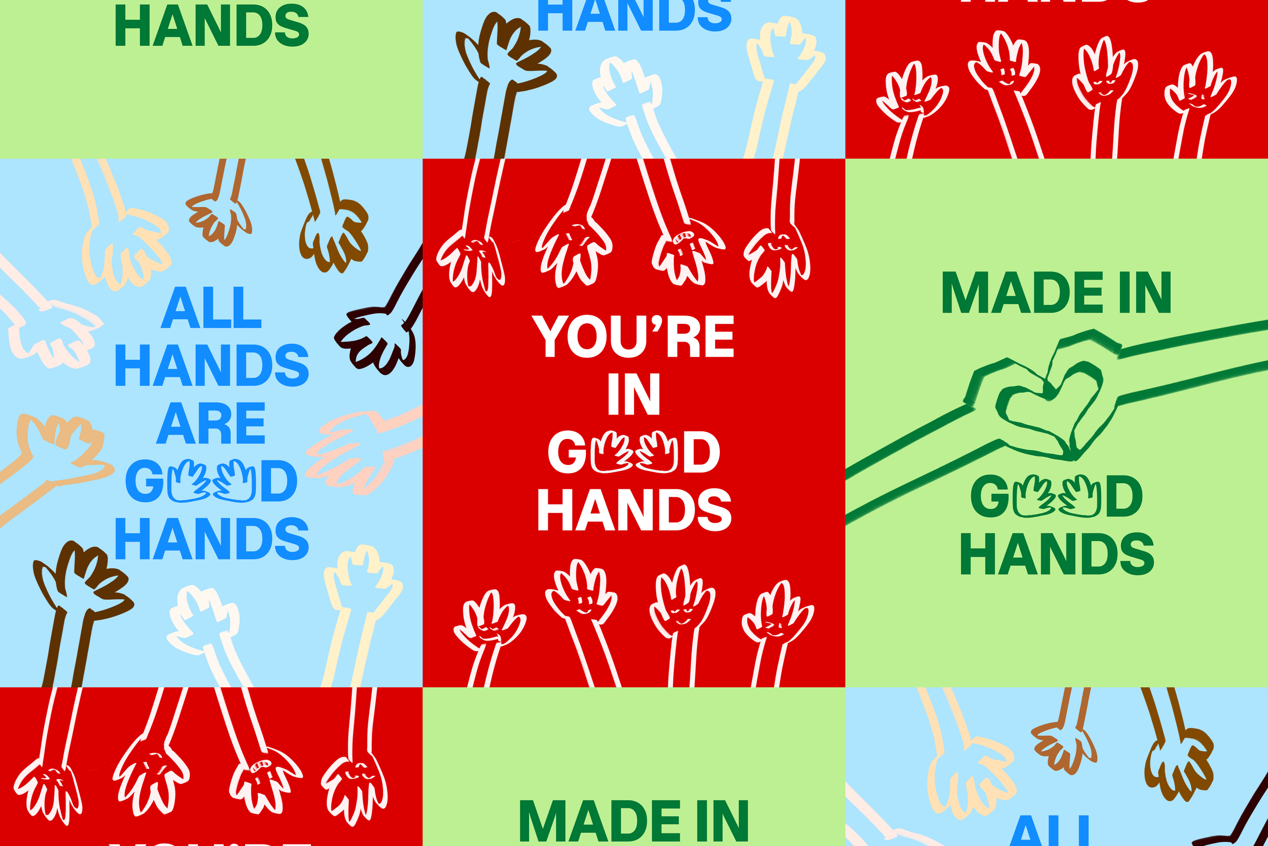
I wanted to experiment with different colors, illustrations and messages for Good Hands. So I created additional posters that incorporate the brand name into catchy puns. I wanted to stay consistent with the bold and upbeat vibe while also introducing themes of equality, unity and care, which I had imagined as the company’s values.